Companies worldwide have finally realized that the Middle Eastern market and Arabic speaking consumers are an under serviced demographic. As a result, there is a growing demand for modern Arabic typefaces. More and more international corporations are seeking out Arab designers to create custom fonts and logos to appeal to the Middle Eastern market. Just recently, the BBC launched an Arabic TV channel (BBC Arabic), and MTV followed suite with MTV Arabiya broadcasting from Dubai.
As a graphic designer from the Middle East, I find it just as easy to design Arabic fonts as it is to design and develop Latin (English) fonts. The biggest challenge really comes down to application. The cursive, calligraphic forms of traditional Arabic text – though aesthetically pleasing – simply doesn’t fulfill the needs of our media-driven society. Historically, both Arabic and Latin alphabets are rooted in calligraphic writing, but the similarities end there. One major difference is how the typefaces are designed. Latin typefaces are constructed vertically, and the same letter is set and spaced apart from the other characters. With Arabic letter forms, there are no capitals, yet the same letter can have up to four forms depending on where it falls in a word. They also tend to be more calligraphic since letters within a word are physically linked to each other by a continuous horizontal stroke.
The challenges Arabic type designers are facing today is developing modern fonts for online reading (or screen fonts) as well as fonts that are legible at very small type sizes. There’s also high demand on stylistic Arabic fonts for use in displays and signage.
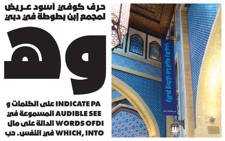
Just the other day, I came across a new Arabic display typeface for the “Ibn Battuta Mall” in Dubai. It’s always refreshing to discover a new Arabic type face that can be applied bilingually. “Bukra Extra Bold” was developed by Lebanese type designer Pascal Zoghbi and is based on the well-known Latin font “Futura Extra Bold”. Designing an Arabic type face with such short ascenders and descenders is no easy feat, especially with a thick pen stroke. “Bukra Extra Bold” reflects the sturdiness and geometric simplicity of its Latin counterpart perfectly.
Contemporary Arabic type design is at the brink of a new and exciting millennium. The past decade has witnessed the influential work of many Arab designers and the market for Arabic typefaces will continue to expand. What I’m left wondering is… Will Latin fonts be able to keep up? For more info on Arabic and Latin font differences, click here.