At the start of a branding and identity assignment I am often asked by our clients which corporate logos I “admire” or think are “the best”. My answers invariably give them a start, but they soon see how these examples can serve as strategic inspiration for their own brand building work. The corporate logos I most admire are designs that I categorize as Blue Collar Design. Owing to the hard working nature of the concept that often lacks the executional flash of high profile or award winning work, Blue Collar Design comes to the factory floor every day and does its job, competently and with satisfactory result. Over the years I have compiled a list of logo designs past and present that embody the success and spirit of Blue Collar Design. Here are a few of my favorites:
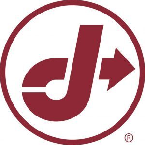
Consider the workmanlike Jiffy Lube logo. In existence with little change for over 30 years, the simple red looping “J” that ends in a rightward pointing arrow has never won a design award. I doubt its designers ever considered entering it in an awards show. But a survey of both customers and non-customers showed that the Jiffy Lube logo possessed a favorable brand impression and was widely understood to communicate the company value proposition of a quick and easy oil change. Jiffy Lube was a first-mover in the “instant oil change” sector and continues to be a leader to this day.
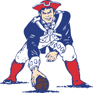
 A little closer to home is the New England Patriots original team mascot Pat the Patriot. “Designed” by a Boston newspaper cartoonist, the logo has been around since the team entered the upstart American Football League in 1962. Hardly an example of artful design execution, the overly detailed illustration successfully brought the revolutionary spirit of New Englanders to the rough and tumble world of the football gridiron. And while Pat has been replaced by “Flying Elvis” as the official team logo for over 20 years, Pat the mascot still has the hearts of Patriots fans and continues to sell millions of dollars in “throwback” merchandise each year.
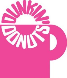
 In service from 1960 to 1976, this version of the Dunkin Donuts logo captures Dunkin’s brand essence in a way that the sleeker and more colorful current logo simply cannot. Its clever typographic rendering of a “dunked donut” in a mug of coffee perfectly communicates the complimentary relationship between the brand’s two flagship products at that time: coffee and donuts. The logo was so successful in fact at product depiction that its executional brilliance ultimately did the design in. As Dunkin sought to expand its offerings beyond donuts in the late 1970’s, the company felt a new logo was needed to dramatically change consumer sentiment.
A little closer to home is the New England Patriots original team mascot Pat the Patriot. “Designed” by a Boston newspaper cartoonist, the logo has been around since the team entered the upstart American Football League in 1962. Hardly an example of artful design execution, the overly detailed illustration successfully brought the revolutionary spirit of New Englanders to the rough and tumble world of the football gridiron. And while Pat has been replaced by “Flying Elvis” as the official team logo for over 20 years, Pat the mascot still has the hearts of Patriots fans and continues to sell millions of dollars in “throwback” merchandise each year.
In service from 1960 to 1976, this version of the Dunkin Donuts logo captures Dunkin’s brand essence in a way that the sleeker and more colorful current logo simply cannot. Its clever typographic rendering of a “dunked donut” in a mug of coffee perfectly communicates the complimentary relationship between the brand’s two flagship products at that time: coffee and donuts. The logo was so successful in fact at product depiction that its executional brilliance ultimately did the design in. As Dunkin sought to expand its offerings beyond donuts in the late 1970’s, the company felt a new logo was needed to dramatically change consumer sentiment.
What ties these three creative examples together is that each had a clear understanding of the target audience and the ownable brand message that no other competitor could challenge. While none of these logos were “design” award winners, each has long been a winner in the minds of the consumers they were intended to attract. And each has taught a profound lesson to generations of smart creatives who were willing to learn: always put the goal of the communication ahead of aesthetics sensibilities—and a hard-working idea will emerge that wins customers–if not awards.