I left a career in the print world to join the agency’s branding creative team. I was nervous. Could I hack it? I knew my role would be changing, and I would be focusing on more digital projects. After a few months, I quickly realized how similar web design is to print design.
Trained as a print designer, I was taught to love margins, let typefaces breathe, and to never be afraid of negative space. While designing for a magazine or print advertisement, I focused on where the readers’ eyes would go first, and where they would look last. When I’m working on a digital project, all of these learned practices still apply. As a designer, I consider it my responsibility to develop the best solutions to display information and to make sure it is easily digestible to consumers on all types of surfaces and platforms. This is called information design.

Where Did Information Design Begin?
Developed as an area of study in the 70’s, information design focuses on simplicity, navigational cues, functionality, and content hierarchy. The practice of information design has been around much longer than the term, dating back to map designs in 1812. In present day, graphic design seems to have been compartmentalized into categories such a web design, package design, print design, and advertising design. Today, not as many designers use the term “information design,” despite the fact that all graphic designers are information designers. It’s the foundation for everything we do.Influences of Swiss Design
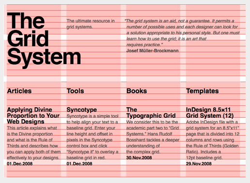
In the 1960’s Swiss advertising design was on the up, utilizing the aspects of information design along with a modular grid system. Swiss designer, Josef Muller Brockman, had a passion for information design and typography. He was known for combining elements such as type, shape, and proportions, and adhering them to a grid. This structured technique is what allows the content of a piece really stand out.“The grid system is an aid, not a guarantee. It permits a number of possible uses and each designer can look for a solution appropriate to his personal style. But one must learn how to use the grid; it is an art that requires practice.” – Josef Muller BrockmanIn modern day design, grids are just as essential to web design as they are for print design. The grid system is extremely helpful to organize information effectively, but it’s crucial that a designer is well-trained in using grids in order to utilize the tool effectively. With a developed theory in design aesthetics and typography, combined with a solid knowledge of information organization, a designer has the tools needed to apply themselves to any project, and any medium.


BOSTON, MA


